
Web design terminology: a glossary for business owners
Confused by web design and development jargon? Use our web design glossary
Read More »Blog
Craig Greenup 26/06/24, 13:11

We’ve already explored e-commerce checkout optimization. So in this post, we’re going to look at an earlier stage in the conversion process: the product page.
The best product pages convince shoppers to click and buy. That’s because they:
Here, we’re going to list 11 product page best practices. These ideas will help you optimise product pages and improve your e-commerce conversion rate. We’ll take a look at some stand-out product page examples, too.
To get more sales and conversions, use these 11 product page best practices on your website:
There’s nothing like seeing a product in real life. Online shoppers don’t have that option. But you can convince customers to add a product to their cart by showing them that product in as much detail as possible.
The best e-commerce product pages provide photographs of products in all colour and material variations and from all angles. These photos are high quality, so customers can zoom in to see products up close.
To follow product page best practices, include photos of your product against a neutral background, free from distractions. But also include lifestyle images. These photos show your product in use and help shoppers to visualise life with your product in it.
Some online retailers go a step further, including videos as well as photos. Videos reveal much more than a static image and give shoppers a clear idea of what they’re buying. So consider making videos part of your product page design.
Product descriptions are another important element of product page optimisation. Here’s what the best product descriptions include:
Product names should include a few product features. They should also use simple, jargon-free language that appeals to your target market.
The things that make your product different from your competitors. Try to avoid clichéd phrases like high-quality and industry-beating. Everyone says stuff like this so it doesn’t resonate much with shoppers.
Sure, the waterproof coat you’re selling may have a fleece lining. But link this feature to its benefit — the fact that the wearer can stay warm and enjoy the great outdoors in all weathers — and you’re more likely to grab customer attention.
Don’t encourage customers to look elsewhere by missing vital details from your product descriptions. Include things like dimensions, materials, colour options, technical features, product care info or a size guide.
Ensure your product descriptions are easy to read and scan by using bullet points.
Use your brand tone of voice through all website and marketing copy, including your product descriptions. It helps to engage users and inspire their trust.
Tread carefully with this one. You should never stuff SEO key phrases into a product description where they don’t belong. But — as part of engaging, on-brand copy — they can help users find your products online.
Next on our list of product page best practices is pricing.
Include all costs on the product page. Tell customers exactly what they can expect to pay, including taxes and the minimum delivery cost.
Also, share any special offers you have available. For customers in two minds about your product, a money-off deal can be enough to get them over this purchasing hurdle.
You can use a banner at the top of your e-commerce product page to highlight discount codes or special offers.
Another way to show customers they’re getting a great deal? Show the original price (with a line through it) next to the discounted price.
Finally, be sure to tell customers if you offer free shipping. 59% of shoppers say that free shipping is a deciding factor in purchase decisions. And 80% expect free shipping if they hit a certain spending threshold.
Customers want to know when their product is likely to arrive. So make it clear to them whether the product they’re looking at is in stock — and when they can expect to receive it after ordering.
If you offer same-day delivery, gift wrapping or the option to choose a delivery time slot, let customers know on your e-commerce product pages.
Also, make it easy for customers to view your return policy and any fees associated with it. Customers should go into the checkout process knowing exactly what to expect. If they feel misled, they’re more likely to switch to one of your competitors.
Online shoppers are a wary bunch. In a world of online scams, it doesn’t take much for them to get the heebie-jeebies about a website. They’re also understandably reluctant to hand over their cash if they’re worried about the quality of the product or your service.
Trust signals help overcome these customer concerns.
Customer reviews — of both individual products and your store — are vital. Reviews reassure shoppers that other people have had a good experience with your brand. And they lead to an 18% uplift in sales.
You should also display any security certifications. This shows you meet the security requirements of third-party organisations. Product guarantees or warranties are another great way to increase customer trust.
If customers can’t find your call to action (CTA) button, they can’t add your product to their cart. So this button needs to be obvious.
That means using colours that stand out from the rest of the page. It means using CTA text that tells users exactly what will happen next. It also means putting your CTA above the fold, so users don’t have to scroll to find it.
Some websites have a sticky CTA that moves with customers as they scroll your product page. That way, as soon as they have all the information they need, they can click Add to Cart.
A/B testing can help you decide on the best CTA placement and design for your website and audience. By regularly testing variables, like copy and colour, and tracking click-through rates, you can create a more successful CTA.
Customers don’t always take your word for it. When it comes to the brilliance of your product and/or service, they’re more likely to believe someone impartial.
That’s why, to optimise your product page, you need social proof. Customer reviews (as mentioned above) act as social proof. So does user-generated content (UGC).
To encourage UGC, create a hashtag. Then, ask existing customers to use the hashtag, sharing content on social media that shows your products in use. You can then display photos from customers as part of your product page design, showing prospective customers what your product looks like in real-life settings.
Quotes from experts also act as social proof. For example, if you had a skincare product, you could ask a dermatologist to give a review. Put praise from an expert on your product page and you’re more likely to inspire customer confidence.
Your e-commerce product pages are the perfect place to upsell or cross-sell. So show users how to style a t-shirt with other products from your range. Or highlight the accessories that go with their new gadget.
You can also show Recently Viewed Items to remind customers of other products they’ve been looking at. Alternatively, you can draw their attention to products within a money-off bundle.
Another useful tool for customers — particularly when comparing similar products — is a comparison table. Provide a comparison table as part of your product page design. Or let users generate their own based on the products they’re interested in. It may be that the original product doesn’t quite fit their needs but another in your range does.
Emotions play a big part in our shopping decisions. And lots of online retailers use scarcity and urgency tactics to get more products in carts.
Some e-commerce product pages show how many people are currently looking at a product. Or highlight the limited number of products left in stock. Others have a countdown timer that shows customers how long they have left to secure next-day delivery or a discounted price.
These tactics work because they make customers fearful of missing out. But you should use them carefully. Scarcity and urgency strategies can be off-putting to customers when used in excess. They’re the online equivalent of the hard sell and aren’t appropriate for all products or audiences.
If you follow product page best practices, the vast majority of customers will find all the information they need on that one page. However, there will always be a few customers who need a little extra help and support.
For these customers, make customer support easy to access. An FAQ section can come in useful. A phone number acts as a trust signal and allows users to get in touch easily.
Many online retailers also have a link to a chatbot on their product pages. This bot can try to answer customer questions before referring customers to a human if they fail to resolve the issue.
The final point on our list of product page best practices concerns the user experience (UX).
We know that 69% of UK shoppers use their smartphones to make purchases. They also expect website pages to load in as little as three seconds.
So your product pages — like the rest of your site — need to be fast and responsive. Your site should work as well on mobile as it does on desktop, offering an exceptional UX across all browsers and devices.
Want some inspiration for your website product pages? There are lots of great product page examples out there. Here are a couple of brands putting these product page best practices into action.
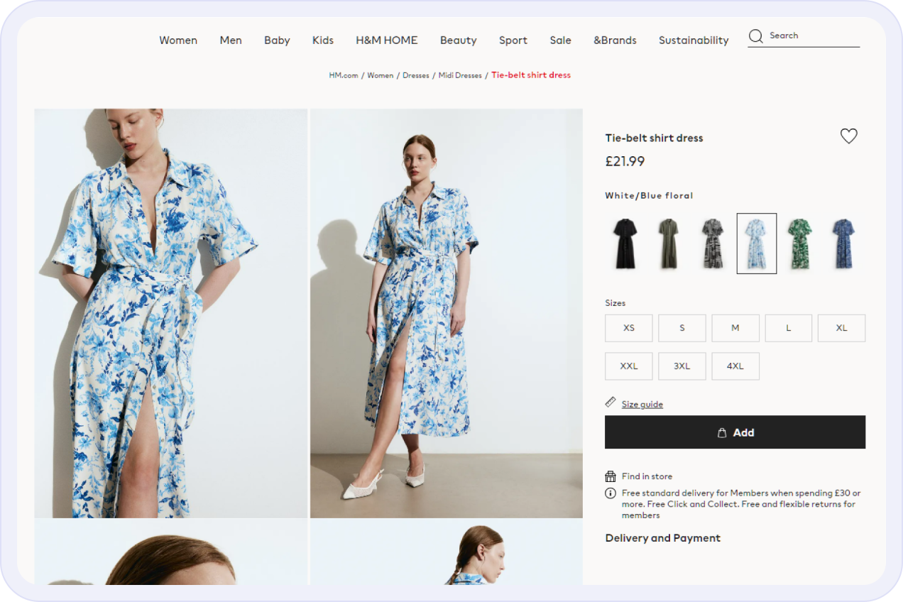
H&M gives customers lots of useful information upfront. The brand’s product pages tell shoppers that free standard delivery is available for members when they spend £30 or more. All customers are entitled to a free Click and Collect service. Members also get free and flexible returns.
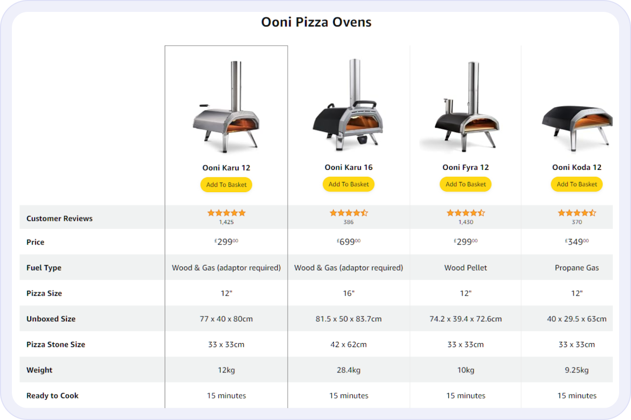
Amazon sets the standard for product comparisons. In this product page example, we see different models of the Ooni pizza oven side by side in a comparison table. This makes it easy for customers to compare practical features — like fuel type or pizza size — along with customer ratings.
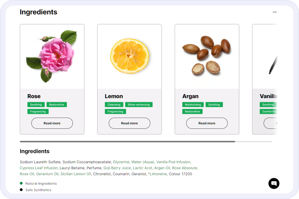
Lush knows that its customers care about the origin and sustainability of product ingredients. So on their product pages, they make it easy for customers to find out more. They give the lowdown on main ingredients. And link to a transparent description of every single ingredient, describing its origins and properties.
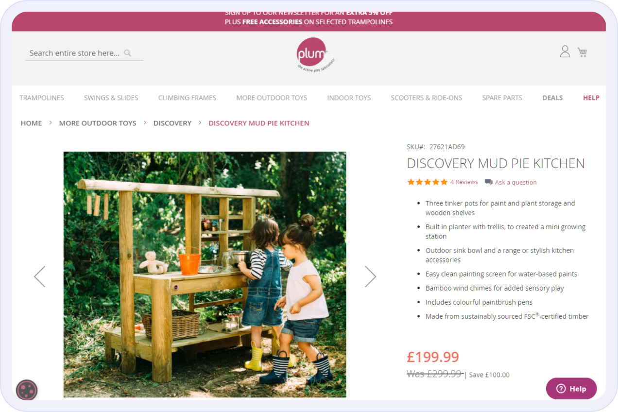
On Plum Play’s product pages, we see a couple of best practices in action. We find out how much money we’d be saving by buying this product today. There’s a banner at the top of the page telling us how to get money off. Customer help is also clearly signposted with a sticky help button in the bottom right-hand corner.
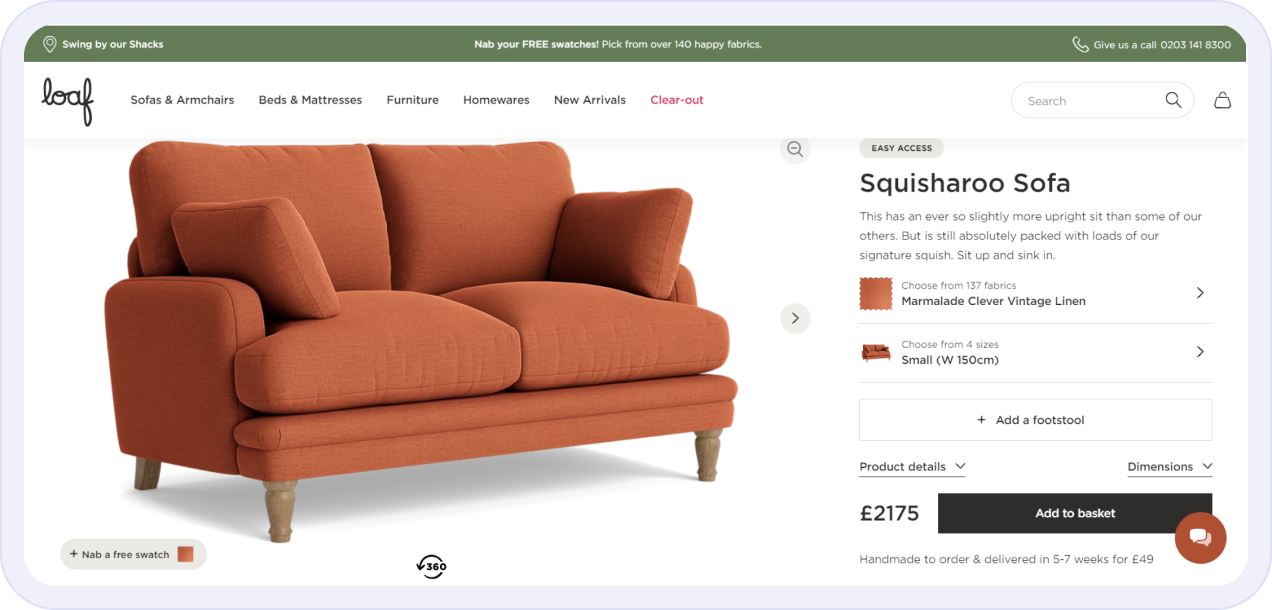
Loaf really understands product page optimisation. On this product page for their Squisharoo Sofa, the brand’s distinctive tone of voice comes across clearly in the product description. Customers also get to see products in lots of lovely detail. They can rotate the image of the sofa 360 degrees and view images of the sofa in their chosen size and fabric.
Want product pages like these for your e-commerce website? The Radical team can help you put product page best practices into action. Get in touch and tell us about your website issues and goals to get started.
How to Choose a Colour Scheme for Your Website
5 top website animation techniques for your web design
03
Mar
Confused by web design and development jargon? Use our web design glossary
Read More »11
Feb
We explain what a WordPress website agency is, what to expect from WordPress specialists and when bespoke WordPress design and development make sense.
Read More »06
Feb
Learn what mobile web design is and why it matters. Plus best practices and optimisation tips for creating a fast, mobile-friendly website.
Read More »
